19 Jan What is White Balance in Photography? Guide for Product Shoots
Have you ever taken a t-shirt photo and wondered why the product colors look off, too yellow, blue, or just unnatural? In product photography, even slight color changes can mislead customers and reduce trust in your brand. This is where white balance (WB) comes as a game-changer.
The white balance in photography ensures your products look natural and professional, just as your eyes perceive them. Curious thinking: How can you achieve accurate and vibrant colors, mastering white balance?
Go through our complete guide & discover –
- What is white balance in photography?
- How WB works
- How to adjust it and
- Expert tips to avoid common mistakes.
Without more talk, let’s get started!
What is White Balance in Photography?
White balance refers to a camera setting that ensures accurate colors of white. It produces a baseline from which all other colors are measured. Whereas, the white balance (WB) in photography refers to the process of removing or neutralizing color casts in images.
Different light sources, like sunlight, incandescent bulbs, fluorescent lights, and others, have their own color temperature, which can give your image a warm or cool cast. Proper white balance ensures all colors in your photo look natural. Common white balance settings are:
- Auto WB (AWB): The Camera chooses WB automatically. Good for quick shooting, but can be inconsistent.
- Preset WB: Daylight, Tungsten, Fluorescent, Cloudy, Shade, or others. Best when the lighting matches the preset.
- Manual/Custom WB: Set using a grey or white card. Ideal for product or studio photography.
However, white balance is essentially the camera’s color correction system to present products’ true colors.
Understanding Color Temperature
Color temperature is a system to measure the color characteristics of a light source, ranging from warm colors to cool colors. It is measured in degrees Kelvin (K); the numerical values. Higher values are cooler tones, such as blue. Whereas, lower values are warmer tones, such as yellow. Examples of color temperature by light source are:
- Sunrise/sunset (3200K)
- Natural Daylight (5500K)
- Blue Sky (1200K)
- A candle light (1500K)
In essence, Color temperature is a measurement of light’s warmth or coolness, expressed in Kelvin. And it’s essential for:
- Accurate color reproduction.
- Proper white balance.
- Creative control over mood, and
- Consistency across images.
Whether you deal with natural lighting for outdoor shoots or man-made lighting fixtures for indoors, light can come in a wide variety of intensities, values, and temperatures. So, be aware of varying color temperatures and make adjustments to fine-tune your image.
Step-by-Step Guide to Setting White Balance for Product Shoots
Accurate white balance is the foundation of true-to-life product colors, especially for eCommerce, catalogs, and advertising. Below, we’ve shared an in-depth, practical guide so you can follow on any product shoot.
Assess Your Lighting Setup
Before adjusting your camera settings, analyze the type, direction, and consistency of light.
Key things to check:
- Light source type: Daylight, LED, fluorescent, tungsten, or strobe
- Mixed lighting: Avoid combining window light with artificial lights—it creates uneven color casts
- Light modifiers: Softboxes, reflectors, and diffusers can slightly alter color temperature
Pro tip:
For product photography, use one consistent light source whenever possible. Studio strobes or high-quality LED lights with a fixed Kelvin rating (e.g., 5500K) provide the most reliable results.
Pick the Right Shooting Mode
Your file format and camera mode directly affect white balance flexibility.
Best practices:
- Shoot in RAW: Allows non-destructive white balance adjustments in post
- Manual exposure mode: Keeps brightness and color consistent across images
- Avoid Auto ISO: Changing ISO can affect color consistency under certain lighting setups
Why it matters:
RAW files preserve full color data, making white balance corrections smoother and more accurate, essential for professional product shoots.
Choose Your White Balance Method (Auto, Preset & Manual)
Different WB methods can be used depending on your workflow, lighting, and desired control. So, choose your perfect WB method from:
1. Auto WB: Most cameras default to the “Auto” white balance setting, which works pretty well. In this AWB mode, your camera examines the scene you’re trying to photograph and chooses a perfect color temperature that works best. But your camera can easily get confused if the scene:
- Won’t represent any white or close to white colors
- Contains mostly one color (e,g, white snow, blue sea, or sky)
- Is it illuminated by multiple light sources with different color temperatures?
However, it is a safe option if you’re just starting your photography journey or shooting in a variety of lighting conditions.
2. Choose a WB preset: As you noticed, AWB sometimes causes issues, so to get the best result, you can use WB presets for flexibility on different lighting conditions (e.g., sunny, cloudy, or fluorescent light). If you select the lightbulb icon from your preset lists and your camera makes adjustments to compensate for what it knows is a warmer light temperature. Presets work well as long as the light in the room comes from a single source.
3. Set WB manually: For mixed lighting situations, manual setting is the best because it involves taking a photo of something white or mid-gray in the same light. For this, select your camera’s “Custom WB mode” and use the recently taken photo’s white or mid-gray content as a reference.
Take a Reference Shot (for Manual WB)
A reference shot tells the camera what “neutral” looks like under your lighting.
How to do it correctly:
- Place a gray card or a pure white card where the product will sit
- Light it the same way as the product
- Fill the frame with the card and take a photo
- Set that image as your custom white balance reference
Why gray cards are better:
Neutral gray reflects all colors evenly, reducing the risk of overexposure or color bias.
Keep Lighting and Settings Consistent While Shooting
Consistency is critical when shooting multiple products or angles.
What to lock down:
- Light position and intensity
- Camera settings (ISO, aperture, shutter speed)
- White balance mode
- Distance between the light and product
Common mistake:
Adjusting lights mid-shoot without resetting white balance. Even small changes can introduce color shifts that are difficult to fix later.
Adjust White Balance in Post-Processing
Utilizing the camera settings, you can set the ideal white balance. But there are several scenarios when you need to adjust WB through post-processing, such as –
- Unwanted color cast
- Ensure color accuracy, or
- Apply a specific creative mood to your images.
However, to get the best flexibility in post-processing, you must shoot in RAW, as JPEG files have limited editing potential for WB corrections. Here are some key ways to adjust WB in photos:
1. Using Temperature and Tint Sliders: This is the most common color correction technique for adjusting white balance. Most software, like Lightroom, Photoshop, or Capture One, provides Temperature (Blue ↔ Yellow) and Tint (Green ↔ Magenta) sliders.
Effective Process:
- Identify the color cast (too warm, too cool, green, or magenta).
- Move the Temperature slider to balance warm/cool tones.
- Adjust the Tint slider to remove green or magenta hues.
- Works best for general WB correction across the whole image.
2. Using the Eyedropper tool: In your editor (Lightroom/ACR), select the eyedropper tool and click on a neutral white or gray area in your photo (like a white shirt, gray card, or concrete) to instantly correct the cast. This is a precise color correction method that removes unwanted color casts while preserving natural tones.
3. Use Curves/Color Balance (Advanced): For more control, use Curves (RGB, Red, Green, Blue channels) or Color Balance adjustment layers (Yellow/Blue, Cyan/Red) in Photoshop to target specific tonal ranges.
4. Fine-tune with sliders: You can set or fine-tune through –
- Temperature – move towards blue to cool (remove yellow) or towards yellow to warm up (remove blue).
- Tint – adjust the slider to correct green or magenta casts (often linked to skin tones).
However, there is another effective solution to correct WB in your images is outsourcing post-processing from a reliable partner, like Masking Aid. Why?
- Time efficiency: Outsourcing frees up your time so you can focus on shooting, client meetings, or creative strategy rather than editing.
- Professional quality & expertise: Photo retouchers specialize in advanced retouching, color correction, white balance adjustment, and creative edits.
- Consistency across projects: Offers you brand-level consistency across e-commerce catalogs, fashion lookbooks, or advertising campaigns.
- Cost-effective: Outsourcing allows you to pay per project or per image, saving on salaries, software licenses, and training.
- Faster turnaround: Dedicated post-processing teams can deliver edited images faster than an individual photographer managing both shooting and editing.
Why White Balance in Photography Matters?
White balance in photography is essential to ensure accurate, natural-looking colors by correcting the color cast created by different light sources. It’s a powerful creative tool to set the mood, making a scene feel warm and cozy or cool and moody, ensuring colors reflect reality.
Here are some key reasons:
- Color Accuracy & Naturalism: Our brains automatically adjust for light color, but cameras don’t; WB makes colors true-to-life, ensuring a white shirt looks white, not blue or yellow.
- Correcting Color Casts: Different lights have different color temperatures (Kelvin); WB counteracts these casts, fixing issues like yellow indoor light or blue shade.
- Mood & Atmosphere (Creative Control): You can intentionally set WB to evoke feelings—warming a sunset or cooling a night scene for artistic effect, adding warmth or coolness.
- Flattering Skin Tones: Incorrect WB can make skin look unnatural (too pale or too orange); proper WB ensures skin tones look healthy and inviting, notes Photography Playground.
- Consistency Across Images: It helps maintain a consistent look and feel, especially when shooting in various lighting conditions or for a series of photos.
White balance isn’t just a camera’s technical setting; it’s about making your photos professional and true to life.
The Impact of Incorrect White Balance
Incorrect white balance (WB) affects the visual quality and commercial value of product, fashion, and advertising photography. Here’s how it creates real-world problems:
1. Color Casts and Unnatural Hues
The common impact is color casts when images appear overly blue (cool), yellow/orange (warm), or even green/magenta, depending on the light source & incorrect settings. Also, colors don’t match reality.
Why it’s a problem:
- Whites no longer appear white
- Skin tones look sickly or unrealistic
- Product colors shift from their true shade
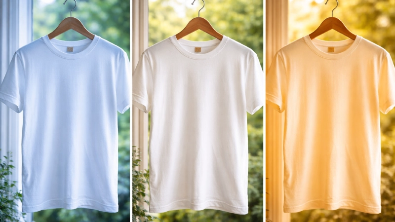
For example, a white t-shirt under tungsten light may appear yellowish, while the same product under fluorescent light can look green. This makes the food look unappetizing or snow-like, appearing blue.
2. Loss of Professionalism and Brand Credibility
Color accuracy plays a significant role in determining the professional appearance of a brand. Incorrect white balance signals poor production quality.
Negative brand impacts:
- Inconsistent visuals across the website, ads, and social media
- Reduced customers’ trust who rely on accurate product colors
- Lower perceived value of the brand
For eCommerce brands, even small color inaccuracies can lead to customer dissatisfaction, negative reviews, and higher return rates.
3. Increased Post-Processing Time
Fixing white balance issues during post-processing requires extra time and effort. Severe color casts often demand advanced color correction, photo retouching, selective adjustments, and manual masking, especially when different light sources affect different areas of the image.
Challenges in editing:
- Extra time spent correcting color casts manually
- Difficulty matching colors across multiple images
- Risk of quality loss, especially in JPEG files
For large product catalogs or fashion shoots, incorrect white balance can slow down workflows and increase editing costs, impacting deadlines and profitability.
Other issues may arise, including muted or washed-out details, loss of mood, and so on.
How White Balance Works
White balance works by adjusting a camera’s color settings to neutralize color casts from different light sources, ensuring white objects appear white and other colors look natural. Cameras do this by –
- Measuring light’s color temperature in Kelvin (K)
- Adding the opposite color to neutralize it
- Using presets or custom settings for precise control, and
- Adjusting manually or in post-processing.
Here’s a detailed guide on how WB works:
1. Light source analysis: Different light sources have different color temperatures measured in Kelvin. For example,
- Warm light (low K): Candlelight (~1000K) or indoor tungsten bulbs (~3000K) cast a yellow/orange hue.
- Cool light (high K): overcast skies (~6000K+) or shade cast a blue hue.
2. Color correction: Your camera’s white balance setting tells the sensor how to interpret these colors so that a white object reflects the same amount of red, green, and blue light. For example,
- If the light is warm, the camera adds blue to the image to neutralize it.
- If the light is cool, the camera adds yellow to balance it.
3. Settings & presets: Cameras offer presets (Daylight, Cloudy, Tungsten, Fluorescent) or manual controls (Kelvin slider) to match the scene.
4. Automatic White Balance (AWB): The camera guesses the light source and applies adjustments automatically, often successfully but sometimes imperfectly.
Now that you’ve a clear idea about the white balance working process, let’s check out some common mistakes that most photographers make in the next section!
What are Common White Balance Mistakes & How to Avoid Them
The seven common white balance mistakes are as follows:
1. Relying only on Auto white balance (AWB): AWB is inconsistent when lighting conditions change. It often fails in:
- Mixed lighting (window light + bulbs)
- Studio setups with colored backgrounds
- Scenes dominated by one color (white tees, green backdrops)
How to avoid:
- Use preset white balance (Daylight, Tungsten, or cloudy)
- Switch to Manual WB mode for consistency
- Lock WB when shooting a series of images
- Use a gray card for accuracy in critical situations
2. Ignoring mixed lighting sources: Different light sources have different color temperatures, like daylight (cool), tungsten (warm), and fluorescent (greenish). This causes uneven tones in one image.
How to avoid:
- Use one type of light source whenever possible
- Turn off ambient room lights during shoots
- Match all lights to the same Kelvin value
- Don’t use a daylight setting indoors under warm lights, which makes photos too yellow
3. Forgetting to adjust WB for every scene: Lighting conditions change between indoor, outdoor, shade, and studio environments.
How to avoid:
- Reset white balance when lighting changes
- Create different WB presets for different setups
- Recheck WB after moving locations
4. Over-correcting in post-processing: Pushing temperature or tint too far results in unnatural skin tones, color-shifted products, and loss of realism.
How to avoid:
- Aim for natural tones; use before/after toggle & scopes (like waveforms) for subtle adjustments
- Compare with a neutral reference
- Check whites and grays first before fine-tuning colors
5. Not shooting in RAW: JPEG files lock white balance, limiting correction, and often degrading quality when adjusted.
How to avoid:
- Always shoot in RAW
- RAW files allow non-destructive WB adjustments
- Ideal for accurate product and brand colors
6. Not using a Gray Card/White reference: Like mixed sources, auto, or presets often leads to inaccurate colors, especially for product photos.
How to avoid:
- Shoot one frame with a gray card or white card
- Set custom white balance in-camera
- Use the reference in post-processing to correct WB instantly
7. Forgetting to adjust tint (Green-Magenta): Many photographers only adjust temperature, ignoring tint, which leads to green or magenta color casts.
How to avoid:
- Always check the Tint slider
- Fluorescent lights often need magenta correction
- Skin tones are a good indicator of tint issues
Quick White Balance Cheat Sheet
Here’s a quick WB cheatsheet:
| Natural Light Conditions | Common Lighting Conditions | Appearance |
|---|---|---|
|
1. Sunrise & Sunset (Golden Hours) |
3500-4500 |
Warm white to neutral white |
|
2. Moonlight |
3500-4500 |
Warm white to neutral white |
|
3. Clear Early & Late Afternoon |
4000-5500 |
Warm white to light blue |
|
4. Clear Noon/Midday |
5000-6500 |
Neutral white to light blue |
|
5. Cloudy & Overcast Daylight |
6000-6500 |
Neutral white to medium blue |
|
6. Thin clouds midday |
6500-8000 |
Cool white to light blue |
|
7. Shade (depending on sun or cloud coverage) |
7000-10000 |
Medium blue to dark blue |
|
8. Clear deep blue sky (morning & afternoon) |
6500-10000+ |
Cool white to dark blue |
| Artificial Light Conditions | Color Temperature (Kelvins) | Appearance |
|---|---|---|
|
1. Candle light |
1000-2000 |
Warm reddish orange to yellow |
|
2. High-pressure sodium (streetlights) |
1700-3200 |
Warm yellow to warm white |
|
3. Tungsten |
2700-3200 |
Warm yellow to warm white |
|
4. Warm white LED |
2500-3500 |
Warm yellow to warm white |
|
5. Halogen |
3000-4000 |
Warm white |
|
6. Soft white LED |
3500-4200 |
Warm white |
|
7. Fluorescent or TL |
4000-5000 |
Off-white to neutral white |
|
8. Cool white LED |
4000-5500 |
Cool white to neutral white |
|
9. Camera flash |
5900 |
Neutral white |
|
10. Daylight LED |
5200 |
Neutral white |
|
11. Full Spectrum LED |
4000-6000 |
Cool white to light cool blue |
Frequently Asked Questions About White Balance in Photography
Why is white balance important?
White balance (WB) or light balance is important to ensure colors in photos and videos look natural and true-to-life, like what the human eye sees. It corrects the color temperature (warm/cool) of light, so whites appear white & accurately reflect the scene’s colors.
How does white balance affect a photo?
White balance (WB) adjusts a photo’s color temperature to make whites appear white and colors natural, correcting casts from different light sources. In short, it impacts the overall warmth or coolness of the entire image, influencing the natural mood.
What is the best white balance for photography?
Auto White Balance (AWB) is great for general use, but presets like Daylight (~5500K) for sunny days, cloudy (~6000K) for softer warmth, and Tungsten (~3200K) for indoor bulbs are the best. However, there’s no single “best” white balance; the ideal setting depends on the light source and your creative goal for photography.
Is ISO the same as white balance?
No. ISO & white balance are not the same. ISO controls your camera’s sensitivity to light (brightness & grain). On the contrary, white balance controls the color temperature (warmth or coolness) of the image, ensuring the colors appear natural under different lighting conditions.
Which ISO is best for photography?
The best & general rule is to keep ISO as low (like 100-200) as your lighting conditions allow to get the best image quality. For bright daylight, the ideal ISO range is 100-200 is ideal, for indoors or cloudy (400-800), and for night or fast action (1600-6400+).
Conclusion
In product photography, getting your white balance right is more than a technical step. It’s essential for accurate color representation, professional-quality visuals, and consistent brand presentation. By understanding and applying the right WB settings, whether auto, preset, or manual, you can ensure your products look exactly as they should, both on camera and online.
Feel free to share your White Balance experience and what difficulties you face!