

- May 25, 2023
- by Isaac Travis
- Guide
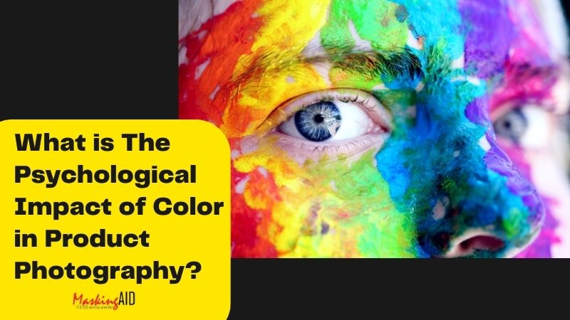
Color plays a vital role to draw to attract human minds. It is the key to reaching target audiences. The psychological impact of color in product photography makes the difference. Consumers’ subconscious mind attracts certain colors and tempts them to buy those particular colors items. A product image works like a particular mood when you highlight the color.
As a product photographer, you need to know the psychological impact of color. It helps you to make the photoshoot effective. If you can incorporate the impact of color in photography you will successfully impress a robust number of clients.
The Physiological Impact of Color in Product Photography
To emotionally attract the buyers it is important to strategically introduce color in product photography. You need to understand how color influences buyers. Online businesses are becoming competitive and you can’t attract buyers with ordinary product photos anymore. But you can easily attract buyers when you think out of the box.
When you connect color effects in product photos to emotionally force the buyers it will work like magic. Undoubtedly it is a secret way to make product photography successful. You can bring a double return on investment (ROI) if you grasp how color influences the human. So here are some tips on how to bring the impact of color in product photography.
Use saturated color:
You can apply saturated color in product photography to emotionally attract audiences.
Adding saturated color is not a one-click job. Some newbies move the saturation slider in Photoshop to bring a saturated color. Unfortunately, that destroys your images and makes it distractive. You need to do it efficiently so that the image looks natural but eye catchy.
I use vibrance strategically so that it holds attention. The color remains back but pops in the consumer’s eye.
Try bold color:
You can try bold colors to make the product image eye-grabbing. A bold color that is different from the image background easily attracts buyers. Suppose you are capturing a donut image and use a color that is completely different from a donut such as purple or sky. It will emotionally attract audiences to your picture.
Single bold color has the power to force human minds to draw to them. Subconscious minds attract them to view the images.
Sometimes multiple bold colors in images also hold the audience’s attention. For example, vegetable photography becomes stand-out if you use multiple bold color backdrops. You can create a contrast with the product to grab the audience’s emotions.
A great example of contrast is when you capture images of lemon you can use a black backdrop. A green and yellow product on a black background will create an appealing contrast that holds the audience’s attention. It is a great way to incorporate human emotions into your pictures.
Impact of Color in Photography
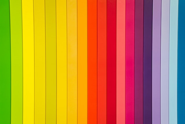
Different colors evoke different feelings, hope, or positivity. Every color contains precise feelings, emotions, and thoughts. You need to pick the right color to give the viewer the exact message. Color tone works as a connection bridge between you and your clients. Let’s know the different impacts of color in photography.
Black:
The physiological impact on black is huge. It is a form of stability, power, or strength. So your product image becomes powerful or stable when you highlight black. Human minds abstractly consider it as powerful or stable.
Black apparel indicates power. Most CEOs wear black suits. So everyone considers them powerful. It also has slimming effects. Even the graduation gown is black. It represents the power of education.
Black is obviously stylish but it makes you important, powerful, and eye-grabbing. Similarly, when you connect black to a product image it becomes stand out in the field. So attaching black makes your photography powerful and engaging.
White:
White represents purity or cleanliness of the heart. When consumers notice white they find it pure or clean. So you can use white in organic food photography. It will bring a pure vibe of food that emotionally connects audiences.
White is another name for innocence. You can create a trust bridge using white color in product pictures. You must notice that doctors and nurses wear white dresses. Because it creates pure thoughts among patients. It amply the innocence of health care workers. We also use white in decorating our home. That is the symbol of cleanliness and purity of heart. So you can include white in decorative items to make it focusing. But it is important to add color correctly.
If you fail to add color naturally that will make the image distractive. So you can take color correction services to play with color and enjoy the emotional impacts of color. It also helps you to highlight pure thoughts.
Yellow:
Yellow has the power to bring happiness, optimism, or cherish to the human mind. Yellow is a symbol of new life. In spring and summer, yellow flowers add life to the earth. You can easily grab attention using yellow.
When you are traveling, yellow traffic lights always catch your eye. So you can use yellow in the product image to make it engaging and focus-grabbing. Human eyes are naturally attracted to yellow. It sparks creative thought and brings joy.
You can highlight happiness and laughter with promotional images. Suppose you are capturing bike photos. Include yellow naturally that represents the happiness of traveling like the below images.

A black bike with a yellow background easily grabs eyes and spreads happiness.
Red:
You can use red to forcefully attract audiences. It is the catchiest color that represents love, anger, or speed. You can include motion in static images by using red. In automotive photographs, you can add a red combination to highlight speed and love. It will easily attract car lovers. They will be tempted by the speedy vehicle.
Red gain attention. You can easily hold the audience’s eyes using red correctly in the product photo. Use the right shape and color to convey the right message to audiences. It will help to maximize your sales. When you include red in the photo it will be tough to overlook. Red has the power to give a signal to your brain to stop you instantly.
Orange:
Using orange can highlight fun or energy. Using a solid orange backdrop in product images gives a secret message of energy. Suppose you are capturing an apple. Place it on an orange backdrop. It will easily spread energy text to buyers. Even it works for orange slices.
Sometimes you can make product images funny to reach target audiences. Basically, oranges physiologically arise appetite and activity. The audience is tempted to see vibrant oranges.
Blue:
Blue provokes calmness and peace. If you are capturing soundproof earbuds you can include blue. It will make the product image more meaningful. Blue will highlight your product’s quietness.
You can also sell yoga mats by using blue. It will remind the buyers about relaxation. The ocean effects also create a peaceful vibe in human minds. A blue suit is a symbol of loyalty. So use the proper color based on product needs to get the best engagement.
Green:
Green is always catchy as it reminds nature. If you want to mention growth or refreshing power you can add green. Green gives a refreshing vibe to audiences.
It is eye soothing and spreads peace. Associate green with different products to highlight freshness, relaxation, or new growth. Green means a new start to life.
Purple:
Purple brings a luxury thought. If you want to give a royal vibe to your product you can add purple. It is the king of color and amplifies the royalty of the product.
Purple arising calmness and brings a wealth of thought. You can add it to jewelry photoshoots. Play with the vibrance and hue to make the product photo catchy and uplifting.
Sometimes it influences romance. But purple is not for nature. Don’t highlight fruits or trees with purple. Man-made products work great in purple.
Psychology of Color in Product Photography
In this article, I try to explain the impact of color in photography and give some tips to understand color effects.
As a product photographer, it is compulsory to know the psychological impact of color. Otherwise, you can’t make your product shoots lucrative. But it is tough to play with color to bring a significant impact. It is not a one-click job. Color corrections, adjustments, contrast, or using bold colors is a creative task. You can’t do it if you are not strategic.
It is better to take professional photo editors to help highlight color to hold human psychology. I know how tough it is to manage the exact color combination in each photo. Retouching can solve your issues. You can get the right color in product images by using color correction services. That will help you to attract buyers emotionally.
Final Thought
The physiological impact of color in product photography can maximize sales and engagement. Incorporating color in product images is the secret to forcefully grabbing audience attraction. You can drag customers’ minds to your product by using appropriate colors.
So it is important to understand the color effects to make your photo outstanding. Try to include the right color that psychologically affects consumers. You need to create emotional effects of color. Follow my tips and tricks to get the best impact of color.